Web Accessibility is one of those topics that gets added to the “someday” list and stays there. We understand. Teams are stretched, priorities compete, and overhauling an entire digital experience feels overwhelming. But here’s what we’ve learned: most accessibility problems don’t require an overhaul. They require intention.
According to the World Health Organization, over 1.3 billion people globally live with some form of disability. When a website or product isn’t built with accessibility in mind, it quietly turns away a significant portion of its potential audience, often without anyone realising it.
We put together this guide for teams who want to do better but don’t know where to begin. These five fixes are practical, implementable today, and make a meaningful difference to real people.
People live with a disability worldwide
Users with disabilities leave inaccessible sites
Total time for all 5 fixes
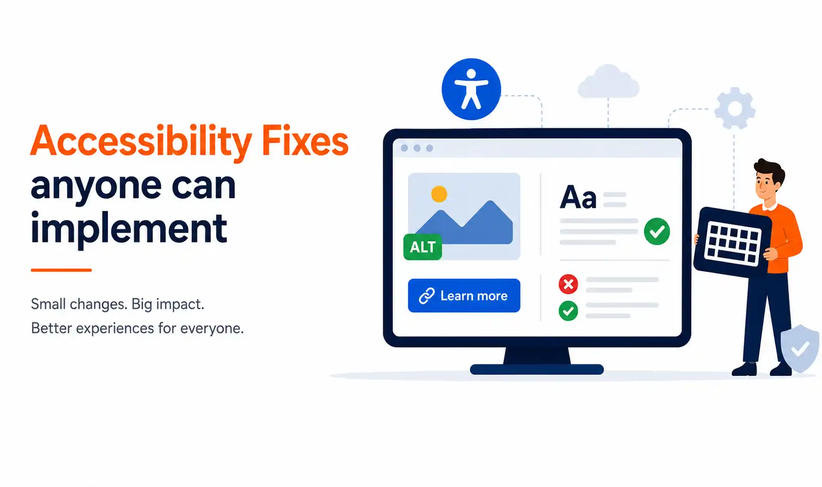
Fix 01: Add descriptive alt text to every image
2-min fix

Alt text is a short written description attached to an image. When a screen reader encounters an image with no alt text, it either reads out the raw filename, often something like “IMG_20240312_0847.jpg”, or skips it entirely. Neither outcome serves your user. We recommend writing alt text that describes the image’s content and purpose, not just its appearance.
Who it helps: Users relying on screen readers, visitors on slow connections where images fail to load, and search engines that index your content.
→ Where to start: Audit your most-visited pages and check that every image has a meaningful alt attribute, not just an empty one.
Fix 02: Improve your colour contrast ratios
3-min fix

Low contrast between text and background, a common aesthetic choice in modern design, creates real barriers for users with low vision or colour blindness. WCAG guidelines recommend a minimum contrast ratio of 4.5:1 for standard body text. Tools like WebAIM’s Contrast Checker make it easy to test any colour combination for free, in under a minute.
Who it helps: Users with low vision, colour blindness, or those viewing screens in bright environments. In practice, improved contrast benefits virtually all users.
→ Where to start: Test your primary text and background colours using a free contrast checker tool. Pay particular attention to light grey text on white backgrounds.
“Accessibility is not a checkbox. It is a commitment to ensuring that your product works for the full breadth of your audience.”
Fix 03: Write clear, descriptive link and button labels
2-min fix

Labels like “Click here,” “Read more,” or “Submit” are among the most common accessibility pitfalls we see. For screen reader users navigating a page by jumping between interactive elements, these labels offer no context at all. Every button and link should clearly communicate its destination or action, “Download our 2025 report” is always more useful than “click here.”
Who it helps: Screen reader users, keyboard navigators, and users who skim pages visually, which is the majority of web users.
→ Where to start: Search your codebase or CMS for instances of “click here,” “read more,” or “learn more” used without additional context.
Fix 04: Never use colour as the only indicator of meaning
3-min fix

Using red to indicate an error and green to indicate success is intuitive, but only for users who can distinguish those colours. Approximately 8% of men and 0.5% of women have some form of colour vision deficiency. Our recommendation: always pair colour cues with a text label, an icon, or both. The colour can remain, it simply shouldn’t be the only way to show information.
Who it helps: Users with colour blindness, users on greyscale displays, and those who benefit from explicit, redundant cues in interfaces.
→ Where to start: Review your form validation states and status indicators. Do they communicate meaning through colour alone?
Fix 05: Test your experience with keyboard-only navigation
3-min fix

This is one of the simplest tests any team can run, and one of the most revealing. Open your website, set aside the mouse, and attempt to navigate using only the Tab key. Can you reach every interactive element? Is it clear where the focus is at all times? If you find yourself losing track of where you are on the page, your focus indicators likely need attention.
Who it helps: Users with motor impairments, screen reader users, power users who prefer keyboard shortcuts, and anyone navigating without a mouse.
→ Where to start: Tab through your homepage end-to-end. Note any elements that are unreachable or any point where focus becomes invisible.
Progress matters more than perfection.
Achieving full accessibility compliance is a journey, not a single project. What we’ve seen consistently is that teams who take small, deliberate steps, starting with fixes like these, build momentum that leads to lasting, meaningful change. If your organisation is looking to take a more structured approach to website accessibility, our team is here to help.