How Retailers Can Build Accessible Online Shopping Experiences

By |2026-05-06T10:51:11+00:00May 6, 2026|Web Accessibility|

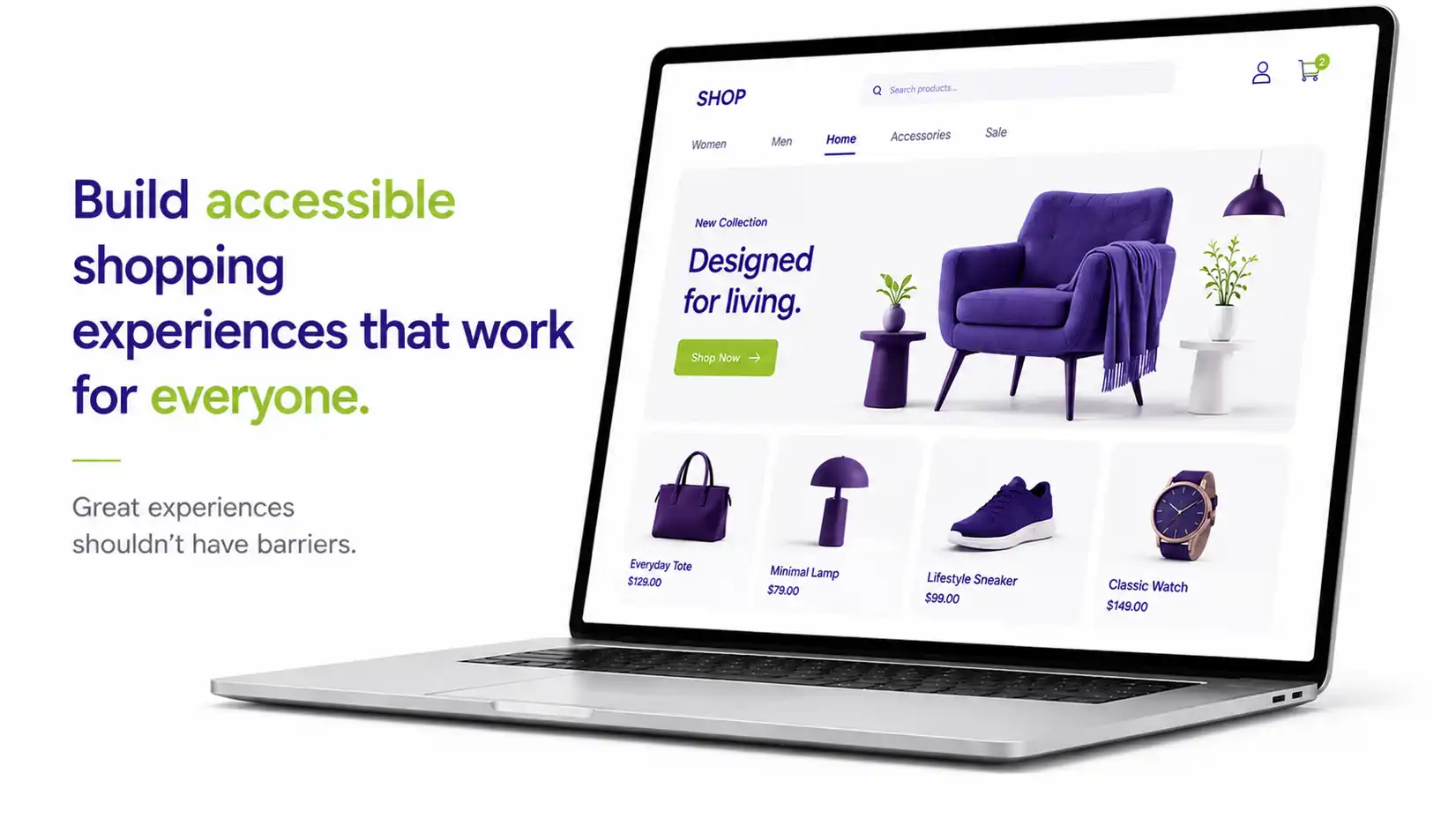
Online shopping should be simple for everyone, but for many users, it isn’t. From navigating product categories to completing checkout, small accessibility barriers can turn a smooth buying journey into frustration. The good news? Fixing these issues doesn’t just help users with disabilities. It improves the shopping experience for all customers.

This guide breaks down how retailers can build accessible online store experiences by focusing on product pages, navigation, and checkout. These are the three most critical parts of the customer journey.

Why Web Accessibility Matters: It is not just about compliance. It is about usability and business growth. Poor accessibility leads to abandoned carts and lost revenue, while simple improvements can boost conversions and customer satisfaction.

1. Accessibility in Product Pages

Product pages directly influence buying decisions. If users can’t understand your product, they won’t purchase it. Here are the key fixes:

  • Add meaningful alt text to images: Describe products clearly (for example: color, features, material). Without alt text, screen reader users miss critical information.

  • Make product details readable and structured: Use clear headings like Product Details, Specs, and Reviews. Avoid cluttered layouts.

  • Ensure variants are accessible: Label size, color, and options clearly. Don’t rely on color alone (for example: red and blue dots without text).
  • Make all elements keyboard-friendly: Users should be able to select size, choose quantity, and add to cart using only a keyboard.
  • Provide complete product information: Prices, stock status, and offers must be readable and not hidden in images or visual designs.

2. Accessible Navigation & Search

Navigation is the foundation of your store. If users can’t find products, nothing else matters.

  • Use clear, logical structure: Organize categories in a way users expect. Use descriptive labels instead of vague words like “Products.”
  • Support keyboard navigation: Menus, filters, and dropdowns must work smoothly without requiring a computer mouse.
  • Add “skip to content” and breadcrumbs: These help users quickly move through pages and understand exactly where they are on the site.
  • Make search and filters accessible: Label search bars clearly. Ensure filters work easily with keyboards and screen readers.
  • Maintain consistency across pages: Predictable layouts reduce mental effort and improve overall usability.

Poor navigation makes people leave the site quickly and makes shopping frustrating, especially for keyboard and screen reader users.

3. Accessible Checkout Experience

Checkout is where web accessibility has the biggest business impact. Even small issues here can cause users to abandon their purchase.

  • Label every form field properly
    Avoid placeholder-only labels because they disappear when someone starts typing and are not accessible.
  • Label every form field properly
    Avoid placeholder-only labels because they disappear when someone starts typing and are not accessible.
  • Label every form field properly
    Avoid placeholder-only labels because they disappear when someone starts typing and are not accessible.
  • Label every form field properly
    Avoid placeholder-only labels because they disappear when someone starts typing and are not accessible.
  • Label every form field properly
    Avoid placeholder-only labels because they disappear when someone starts typing and are not accessible.

4. Improving User Experience for All Shoppers

Here is the key insight: Website accessibility improves the user experience for everyone, not just users with disabilities.

Universal Benefits

  • Better readability means easier mobile usage.
  • Clear navigation means faster product discovery.
  • Accessible forms mean fewer errors.
  • Keyboard support means faster interactions.

Who This Helps

  • People with disabilities and impairments.
  • Mobile users on small screens.
  • Older adults with changing vision.
  • Users in challenging environments like bright glare or slow internet.

Common Web Accessibility Mistakes Retailers Make

Watch out for these frequent issues that create major barriers

  • Missing alt text on product images.
  • Low contrast text that is hard to read.
  • Hover-only menus that are not keyboard accessible.
  • Unlabeled form fields.
  • Generic links like “Click here.”
  • Confusing checkout error messages.

How to Get Started

You don’t need a full redesign. Start with high-impact areas like auditing your product pages and testing your navigation using only a keyboard. Try completing a full checkout without a mouse. Fix your form labels and error messages first. Focus on high-traffic, high-revenue flows, and use accessibility tools combined with real user testing.

Accessible eCommerce is a competitive advantage.

Make online shopping easy for everyone.

Go to Top